All work

Healthcare
IT Platform

Led the end-to-end redesign of a data-heavy healthcare
IT platform used by technical and executive users, improving usability, consistency, and scalability across the product.

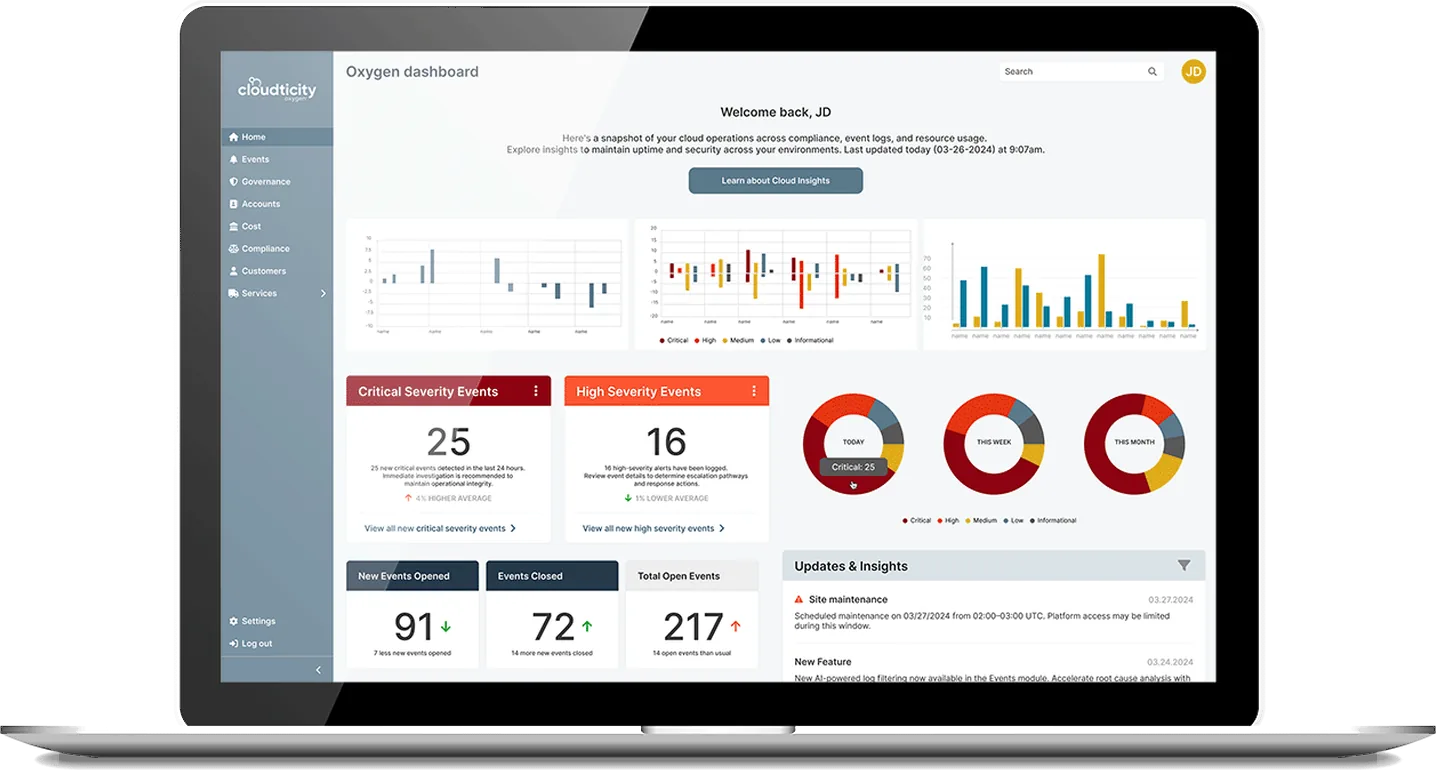
Cloudticity Oxygen dashboard on a laptop
Client
Cloudticity
Role
Lead Product Designer (Contract)
Timeline
Launched in under 4 months
Scope
0→1 · Design system · Compliance · Healthcare · B2B

To comply with my non-disclosure agreement, I’ve omitted confidential information. The data featured here is my own and does not reflect Cloudticity’s views.

The problem

The legacy platform lacked structure, consistency, and scalability.

Cloudticity is a healthcare IT platform that helps organizations manage infrastructure, compliance, and operations. The platform is used by a range of users — from highly technical admins to executive stakeholders — each with different needs, goals, and levels of technical expertise.

The existing platform had been built primarily by backend engineers and lacked a cohesive user experience. As a result, the product was fragmented, inconsistent, and difficult to navigate and interpret.

Key challenges

  • No clear information hierarchy or UX structure
  • Inconsistent patterns across features
  • A highly diverse user base with different roles and permissions
  • No design system to support scalability

My role

I led the design of the platform end-to-end, working closely with founders, product, and engineering to define the experience and establish a scalable foundation.

  • Conducted user interviews and audited the existing platform
  • Defined user flows and information architecture
  • Designed core interactions for data-heavy workflows
  • Built a tokenized, accessible design system

Approach

Bringing structure to a complex, data-heavy system

01Understanding the problem space

I started by working closely with stakeholders and users to understand the platform, its constraints, and where it was breaking down.

  • Conducted user interviews across different roles
  • Audited the existing platform to identify inconsistencies and gaps
  • Mapped key workflows and pain points
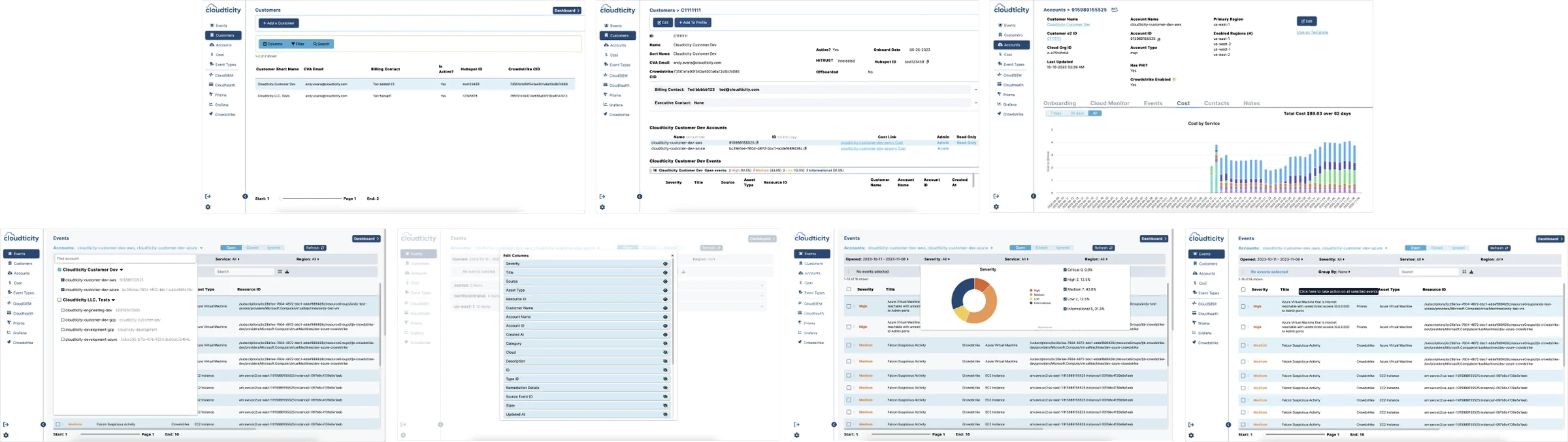
Seven screens from the legacy Cloudticity platform: customer, account, cost and event views with inconsistent layouts
Fragmented and inconsistent interfaces across the platform, with no clear hierarchy or structure.Different modules followed different patterns, making navigation and usability inconsistent.

02Defining structure and user flows

Based on the findings, I focused on creating a clear structure for the product — defining how users navigate, interact with data, and move through key workflows.

  • Established information architecture and hierarchy
  • Defined role-based experiences and permissions
  • Mapped and validated core user flows with the team
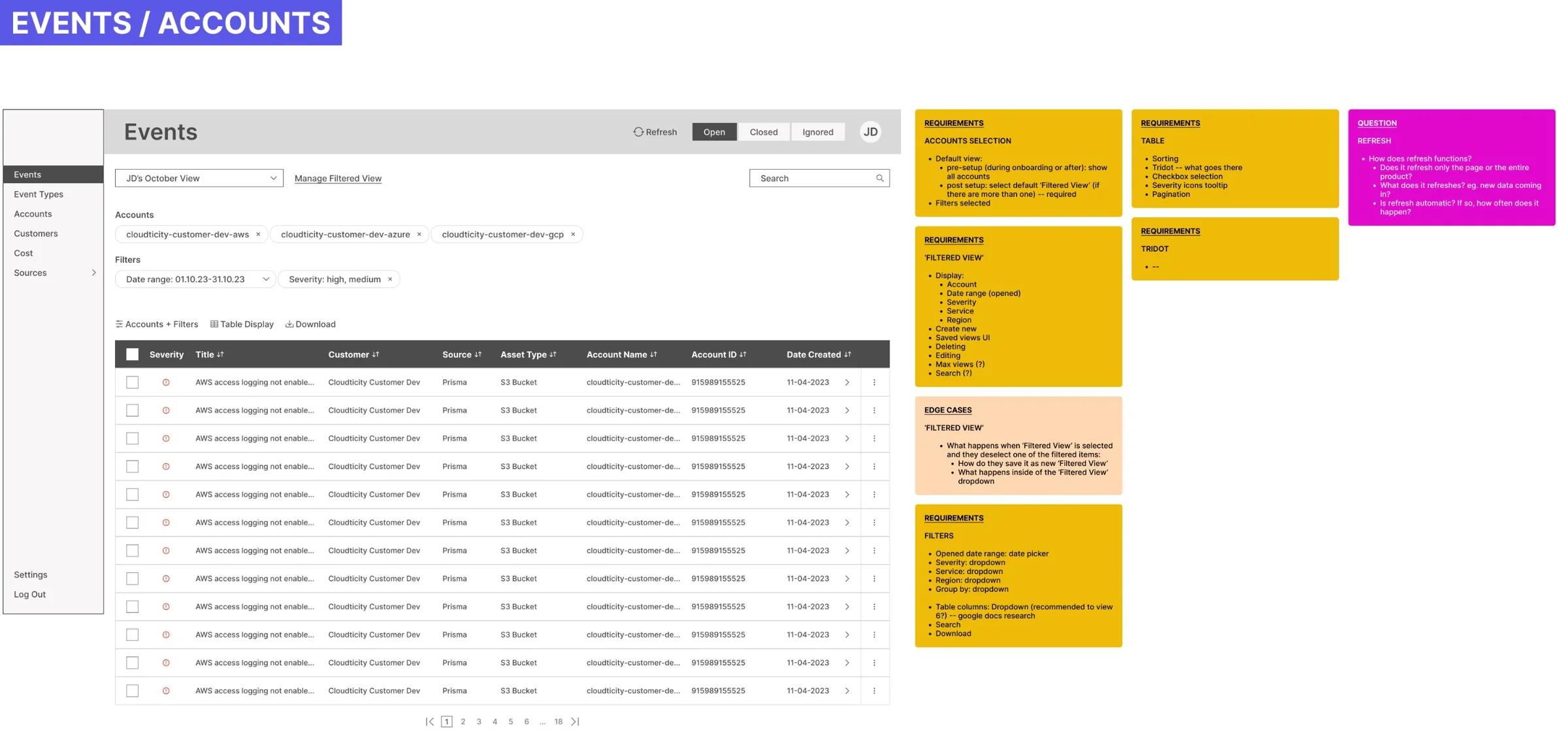
Events and accounts wireframe with requirement, edge-case and open-question notes
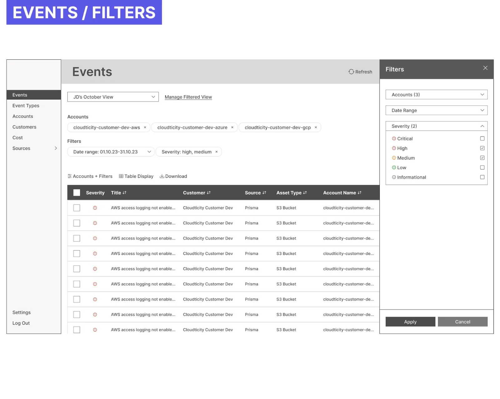
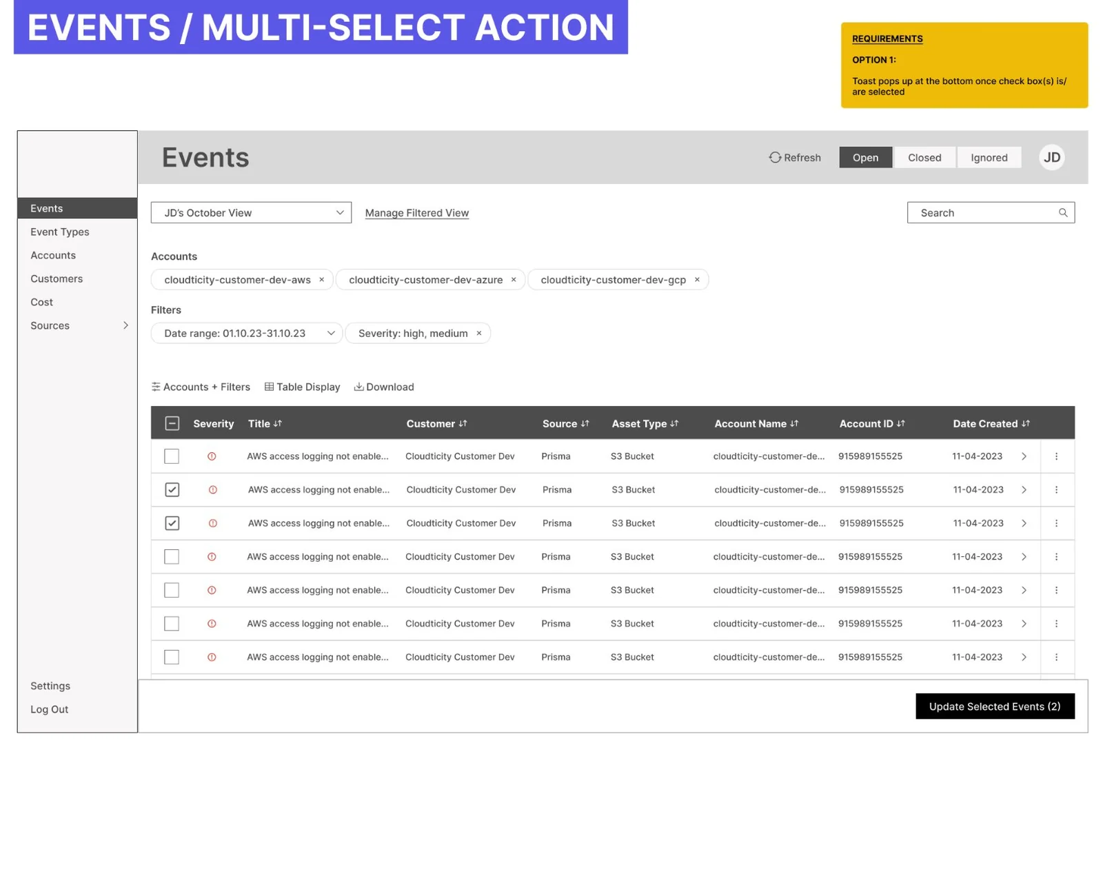
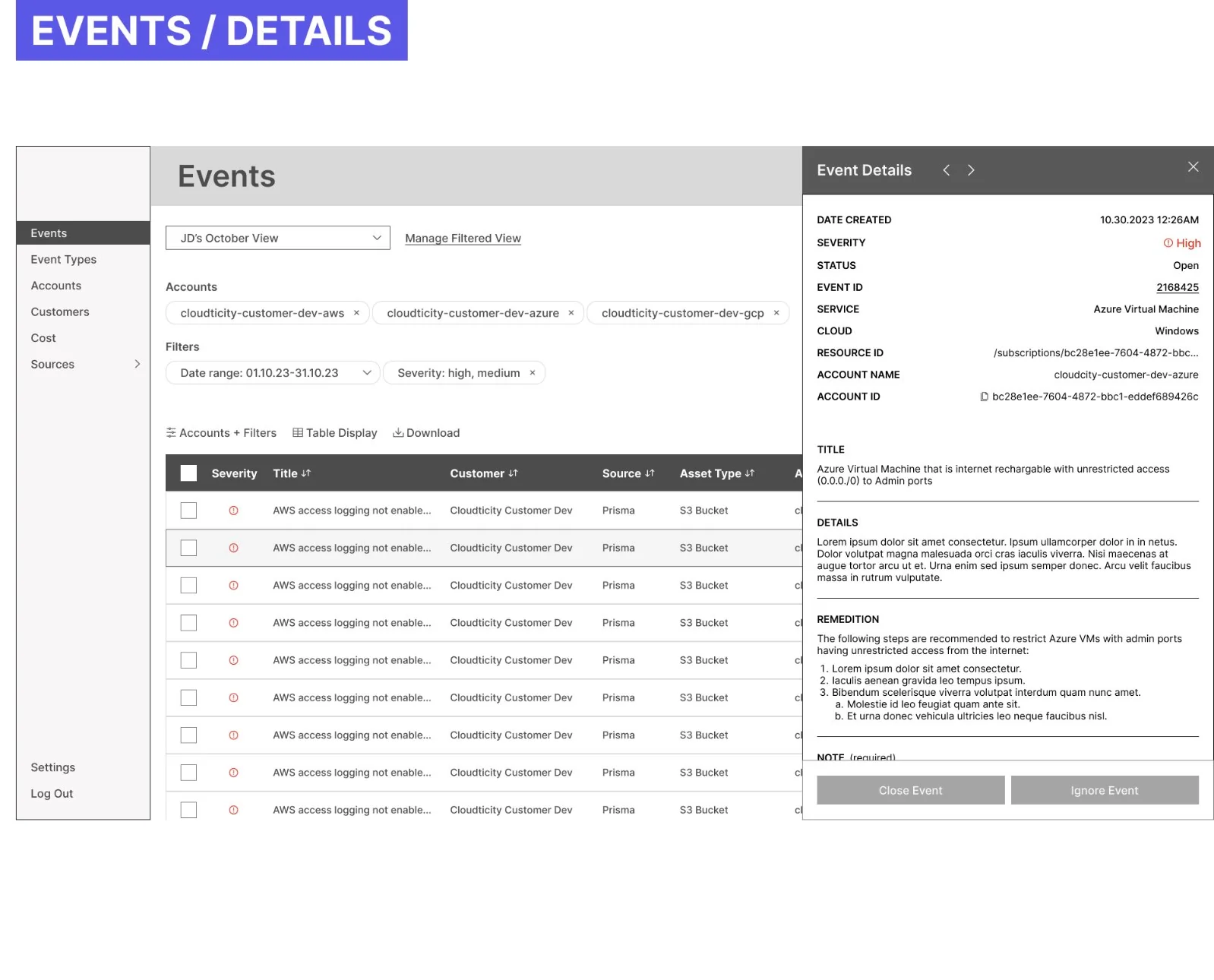
Events filters wireframeEvents multi-select action wireframeEvent details panel wireframe
Defined structure through user flows and information architecture.Mapping workflows helped establish a clear foundation for navigation and interaction.

03Designing core interactions for data-heavy workflows

The core interactions focused on helping users find specific information quickly and act on problems without losing context.

  • Restructured the information architecture around each user group, from detailed event data for technical, internal users (Oxygen) to high-level overviews for executive, external users (Nitrogen)
  • Designed flexible table systems and filtering patterns that scale to other product sections and use cases
  • Created clear visual hierarchy for complex datasets
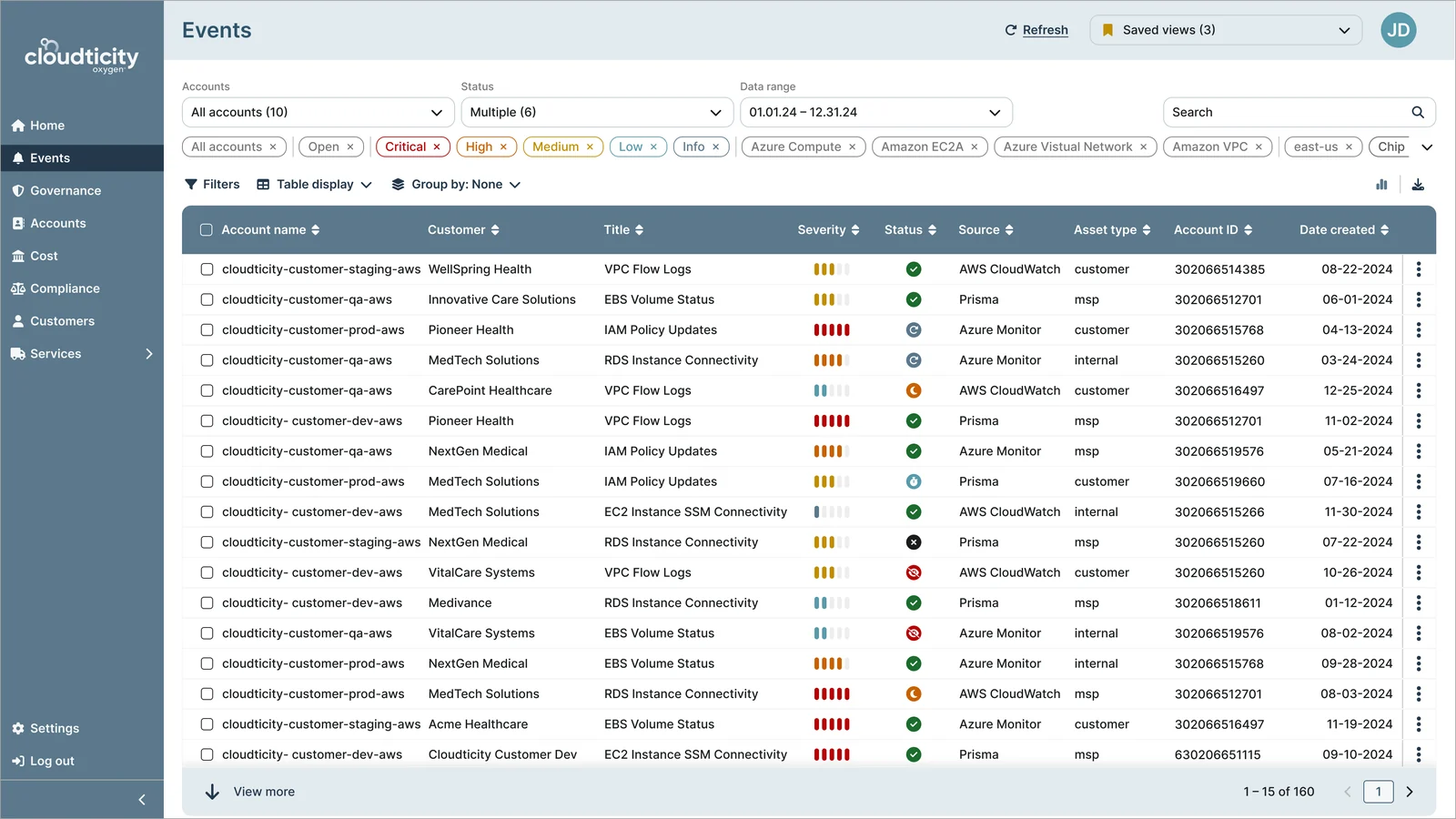
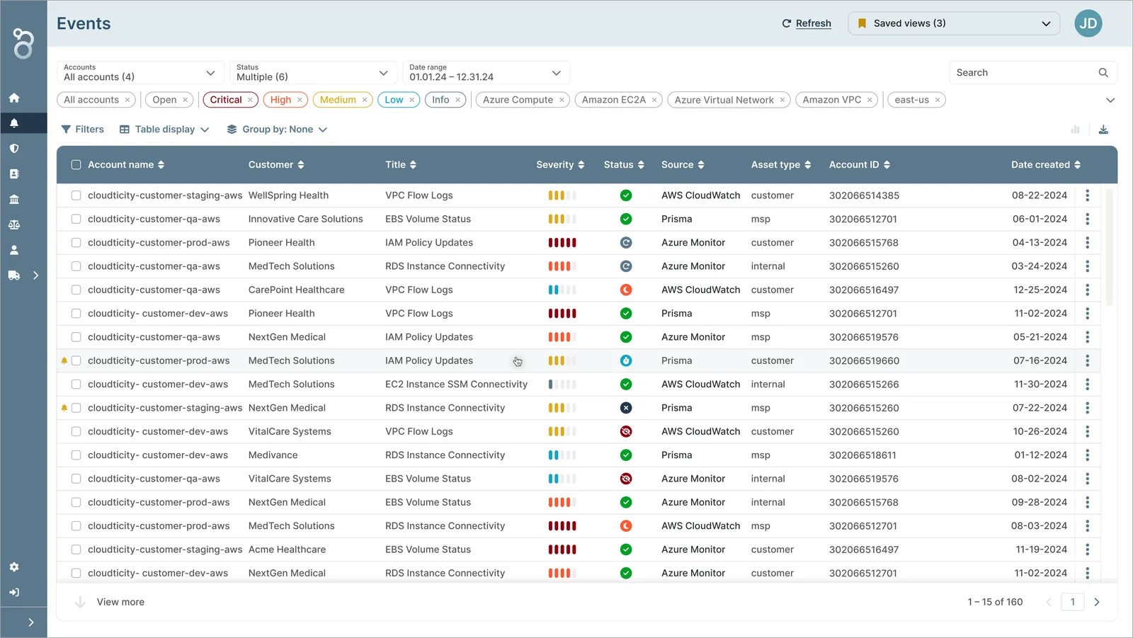
Oxygen events table in a slate theme

01Oxygen

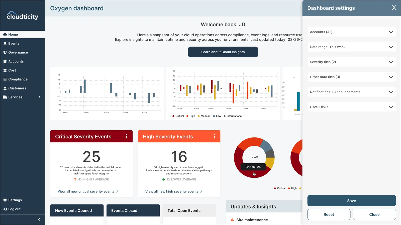
Nitrogen dashboard in a navy theme with the dashboard settings drawer open

02Nitrogen

One platform, with information architecture tailored to each user group.Oxygen and Nitrogen run on the same platform, each surfacing the information its users need most, from detailed event data to high-level overviews.
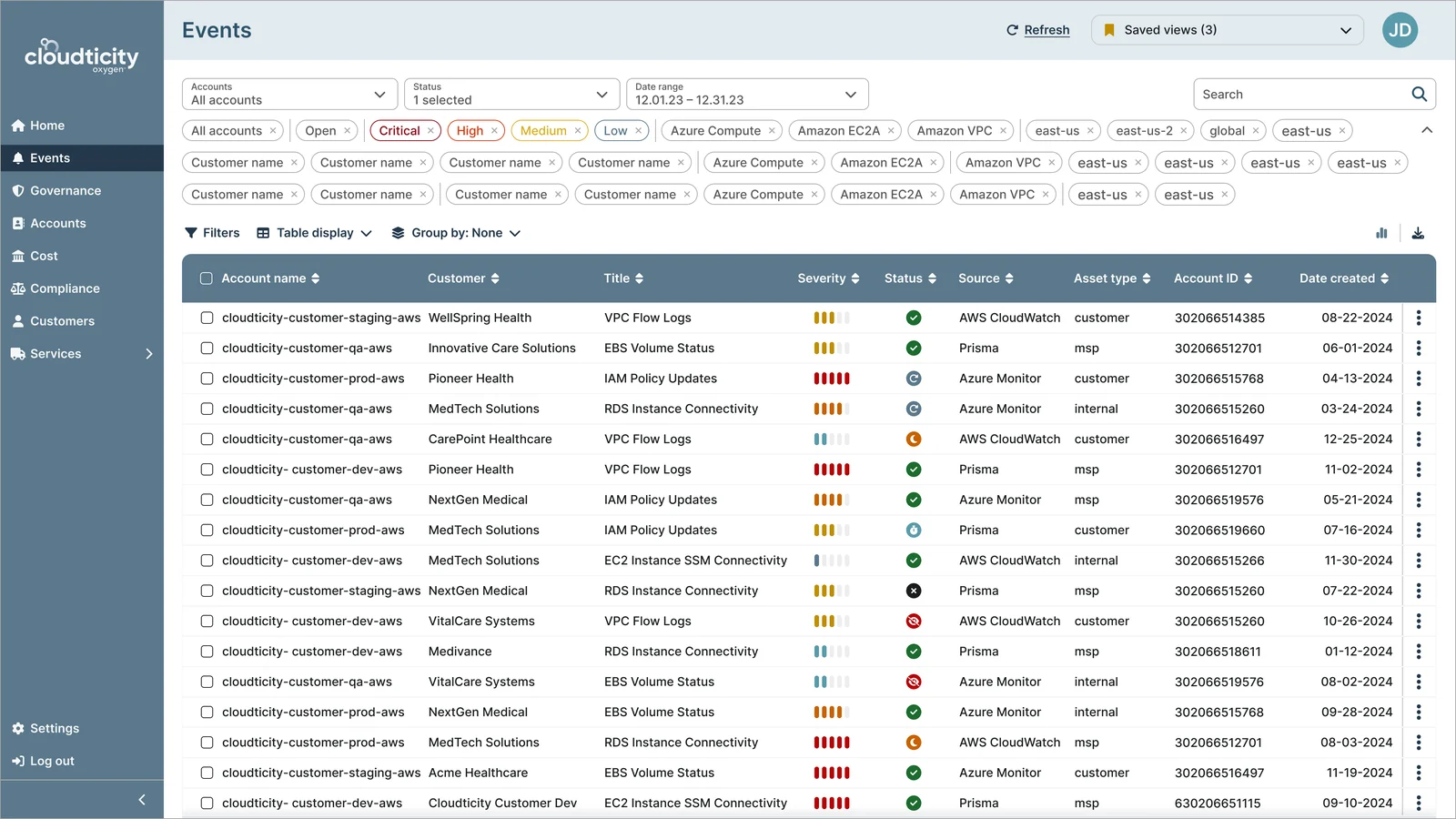
Events table with three rows of active filter chips

01Expanded filter chips

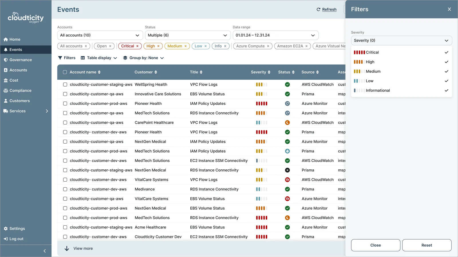
Filter drawer with severity options beside the events table

02Filter drawer

Flexible filtering to surface the right events fast.Active filters stay visible as removable chips, and the filter drawer refines results while the table stays in view.
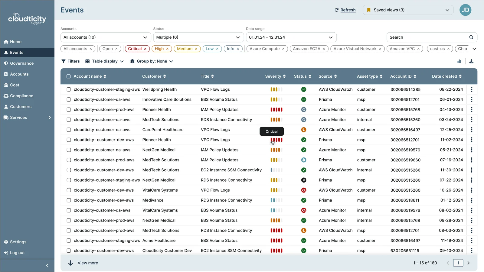
Critical tooltip on a severity bar

01Hover for severity

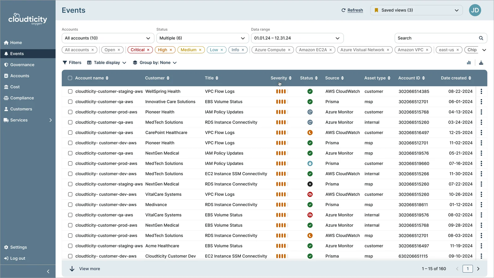
Events table sorted by severity

02Sort by severity

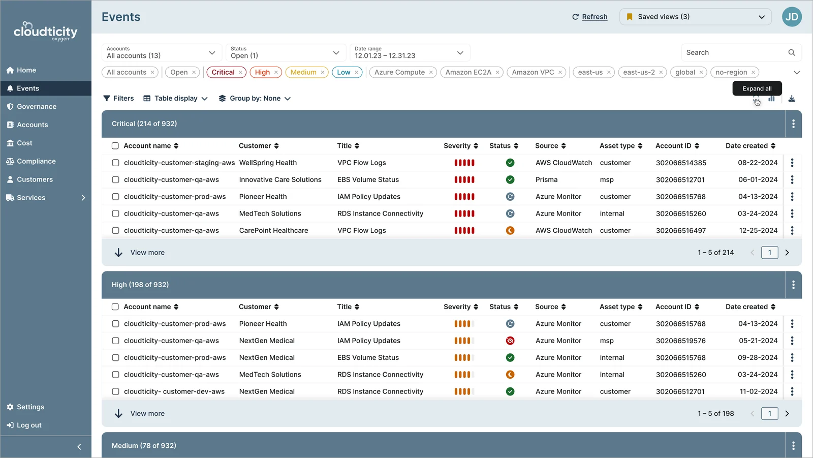
Events grouped into Critical and High sections

03Group by severity

Severity-based views to prioritize what needs attention first.Events can be sorted or grouped by severity, so critical issues rise to the top.

04Building a scalable design system

Once the UX foundation was in place, I developed a tokenized design system to ensure consistency and scalability across the platform.

  • Reusable atomic components and patterns
  • Design tokens for consistency and theming
  • Accessibility considerations to support a wide range of users
See the full design system case study
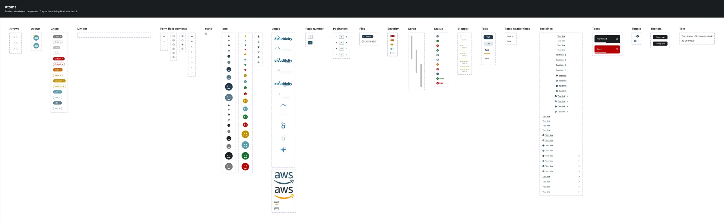
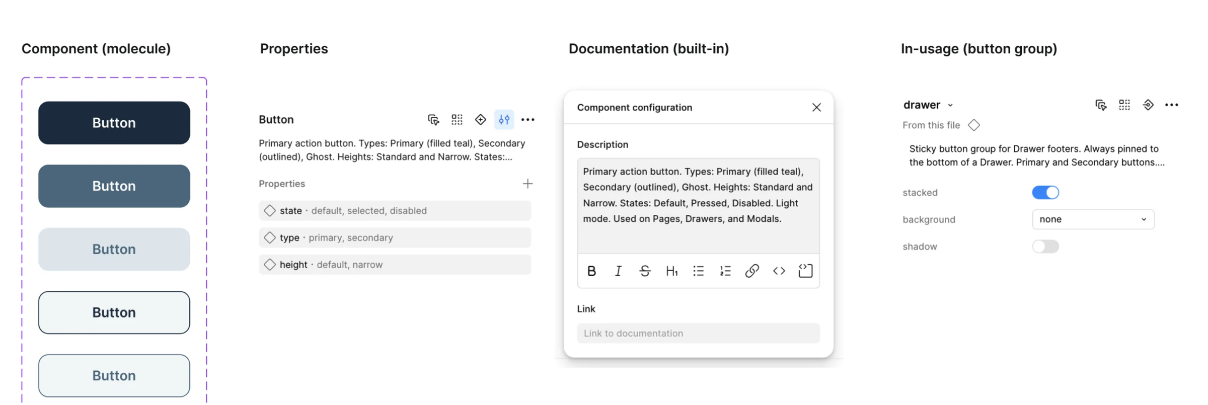
Design system atoms: arrows, avatars, chips, form field elements, icons, logos, pagination, pills, severity, status, tabs, text links, toasts, toggles and tooltipsButton component anatomy: variants, properties, built-in documentation and in-use button group
Tokenized design system for consistency and scalability.Enabled faster iteration and alignment across product and engineering.

Outcome

From fragmented workflows to a structured, scalable system

The redesigned platform launched in under 4 months, transforming a fragmented experience into a structured, scalable product foundation.

Events table with a row highlighted

01Select an event

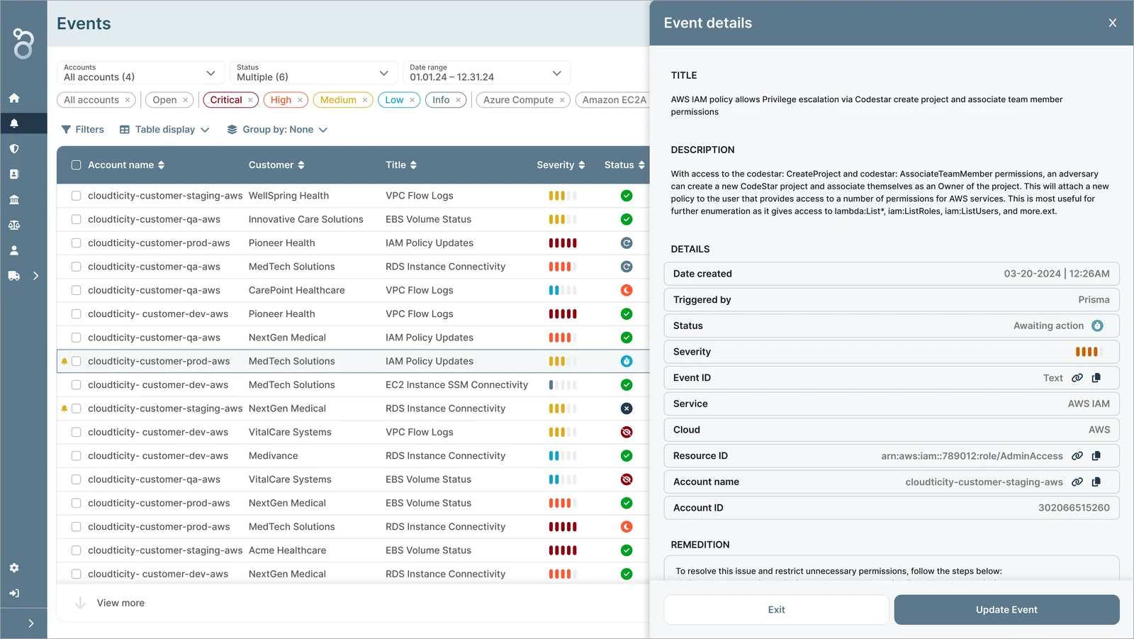
Event details drawer with title, description and details

02Event details

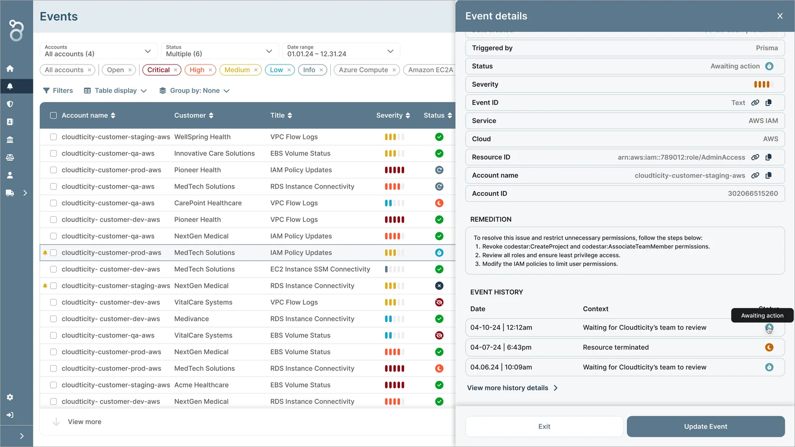
Event details drawer showing remediation steps and event history

03Remediation and history

Event details, remediation steps, and history in a single view.An event opens into full details, remediation steps, and its history, so issues can be reviewed and updated without leaving the table.
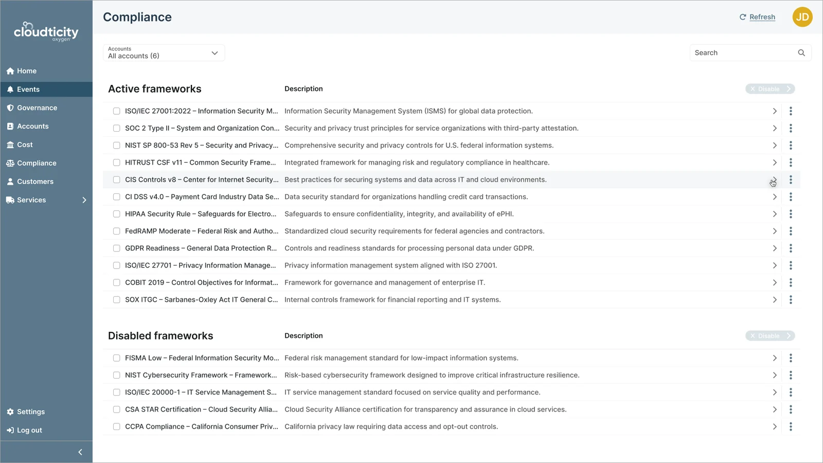
Compliance frameworks list with a row highlighted

01Select a framework

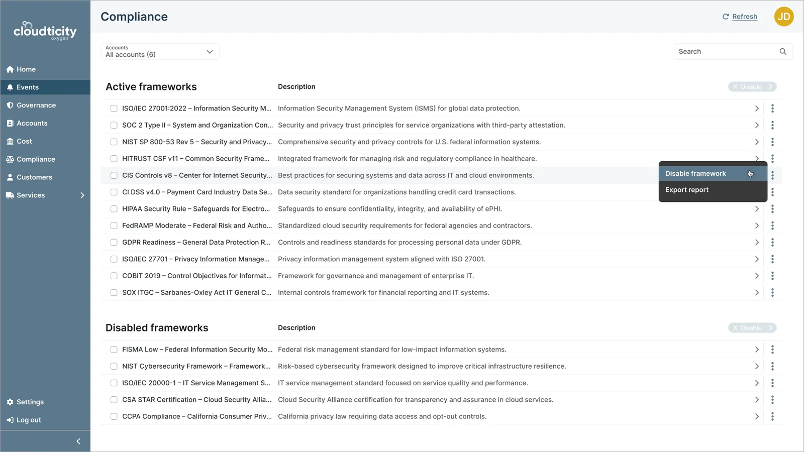
Row actions menu with Disable framework and Export report

02Open actions

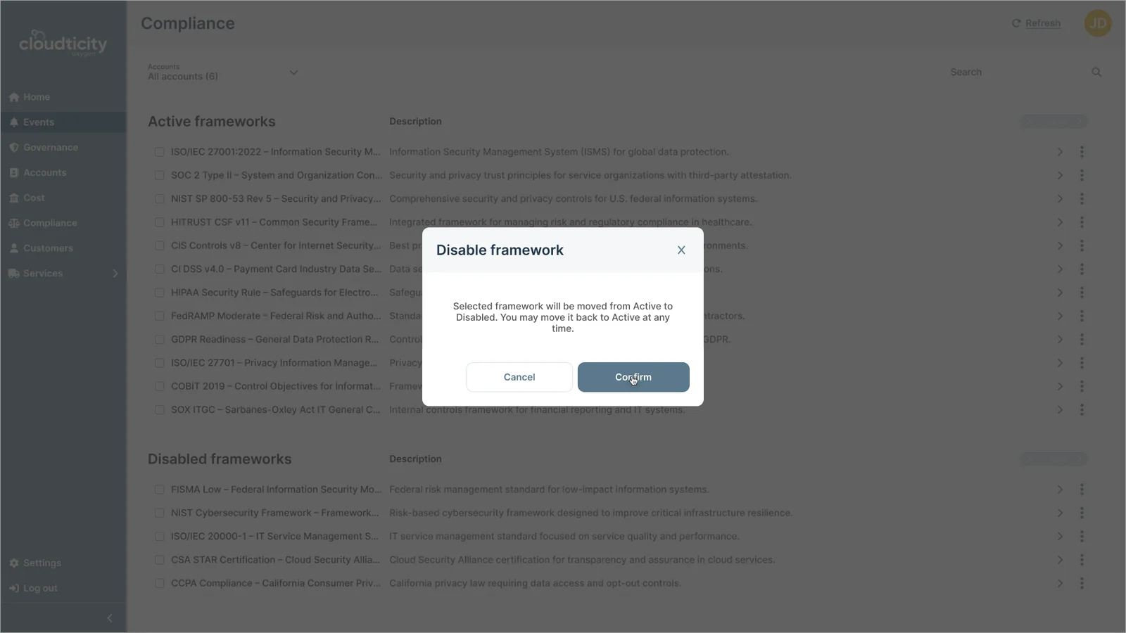
Disable framework confirmation dialog

03Confirm

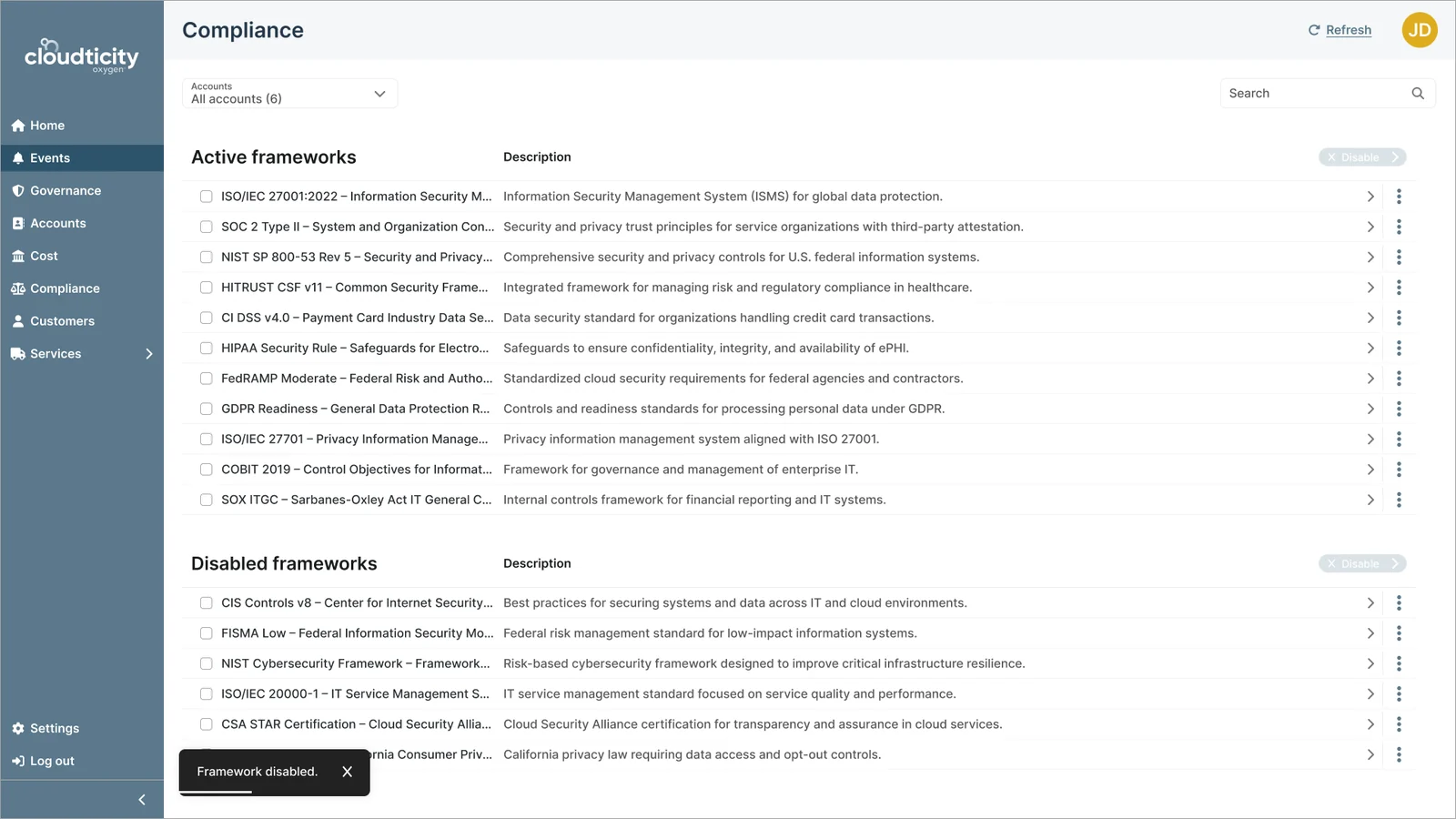
Framework moved to Disabled with a confirmation toast

04Framework disabled

Consistent actions for managing compliance frameworks.Consistent layout, hierarchy, and interaction patterns across modules replaced previously fragmented experiences.
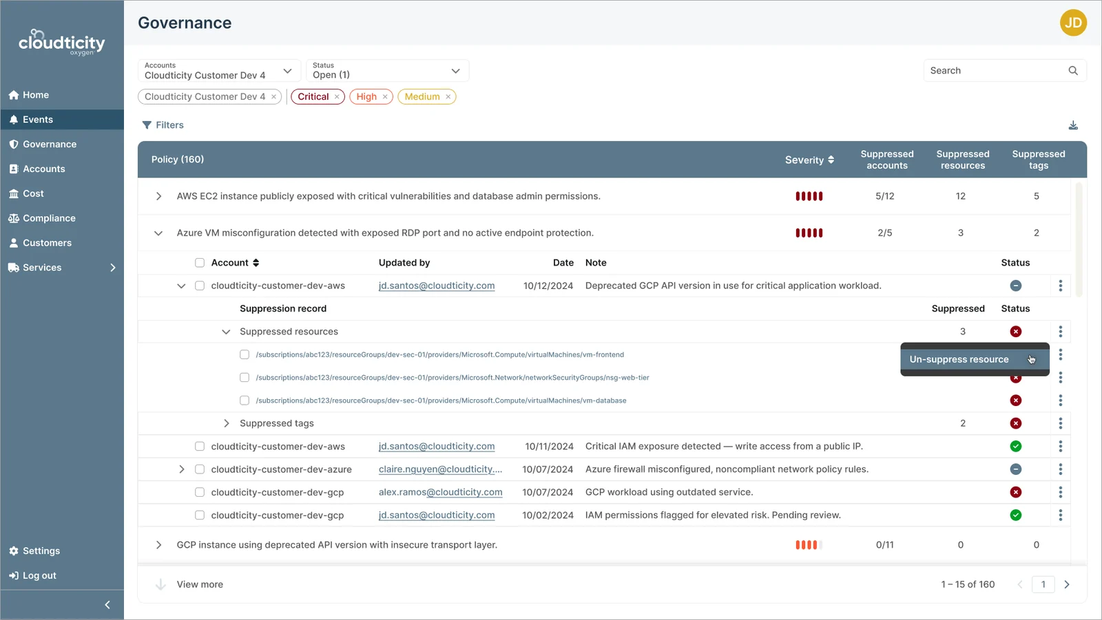
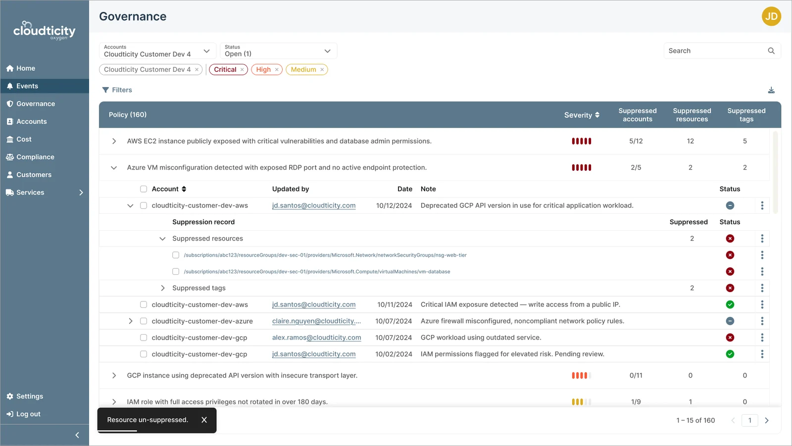
Nested suppression records with the Un-suppress resource action

01Open actions

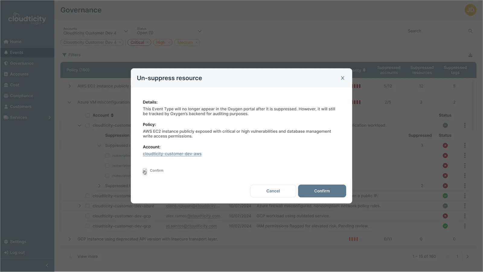
Un-suppress resource confirmation dialog with details

02Confirm

Updated suppression record with a confirmation toast

03Resource un-suppressed

Clear control over nested governance and suppression data.Suppression records nest under each policy and account, and changes are confirmed before they apply, with clear feedback after.

Impact

4 monthsLaunched in under 4 months, from a fragmented legacy app to a full platform
2 silosOne product foundation, extended into Nitrogen and Oxygen
  • Unified a fragmented experience into one consistent, structured platform
  • Faster dev cycles and fewer product/dev iterations, from systemized components and clear standards
  • Simplified complex workflows for IT administrators and compliance teams
  • Improved usability across user types, from technical admins to executives
  • A foundation for expansion into governance, compliance, and account management

Testimonial

Aleks created our entire design system from the ground up, significantly improving both the aesthetic and usability of our cloud infrastructure monitoring app. Her collaboration and communication skills were essential for designing complex, technical UIs required in cloud infrastructure space. The clear standards she established reduced design iterations between product and development which dramatically sped up our workflow.”

JD · Product Owner, Cloudticity

Reflections

This project highlighted the importance of bringing structure to complex, ambiguous systems, especially when designing for multiple user types with different needs and levels of expertise.

One of the biggest challenges was balancing flexibility with clarity: creating a system that could support highly technical users without overwhelming less technical stakeholders. Defining clear roles and permissions became a key part of making the experience usable across audiences.

It also highlighted the long-term value of investing in design systems early. Establishing a scalable foundation not only improved consistency, but enabled the team to move faster and expand the product more efficiently over time.